-
Location:
Cairo, Egypt
-
Date:
July, 2022
-
Client:
Cedar
-
Art Direction:
Yomna Abdelhaq
About the client
Cedar Brothers is a niche brand that specializes in salmon jerky based in Germany, which is not very common in the market, so it was very interesting to work on this project!

Logo Composition

Logo Responsivness
The Challenge
They approached us with a unique set of requirements for their packaging design. The brand’s distinctiveness lies in their premium salmon jerky directly sourced from their farms in Alaska. That’s why they wanted the packaging to reflect the Alaskan environment, also they did not want a transparent window because it would cause a challenge in maintaining the jerky’s shelf life.

Corporate Branding


The solution
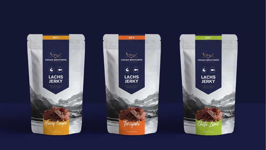
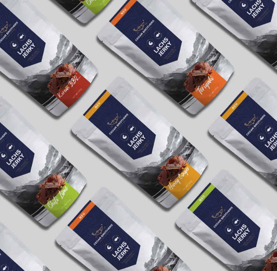
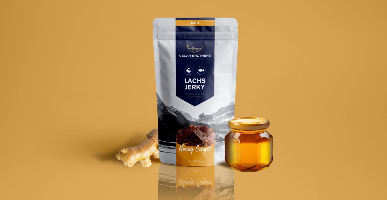
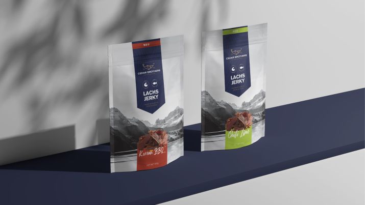
It was a bit of a challenge for us to focus on creating a design that balanced aesthetic appeal with practical functionality. We developed a color-coded system for each flavor, using distinctive colors to differentiate between them. This made it easy for consumers to identify their preferred flavor immediately.
To emphasize the Alaskan origin of the salmon, we integrated scenic backgrounds of Alaska into the design with the label which achieved a premium and neat look. Additionally, we designed the packaging without a window to protect the jerky’s shelf life, so we conducted a photoshoot to use the jerky in the design and it was particularly challenging due to its less appealing visual nature. We tried to make it look as appetizing as possible to compliment the premium packaging design.
