-
Location:
Cairo, Egypt
-
Date:
July, 2022
-
Client:
Horayra
-
Art Direction:
Sera Samir

Logo Composition
About the brand
Horayra is a renowned Saudi brand that offers a wide array of high-quality cat food all over Saudi Arabia. The brand draws its inspiration from Abu Hurayrah, one of the companions (Sahabah) of prophet Muhammad, who was famously fond of cats and always had one by his side. That’s why he was named Abu Hurayrah meaning “The father of a kitten,” so Horayra was created to celebrate and care for cats with the same love and dedication.

Logo Responsivness
The Challenge
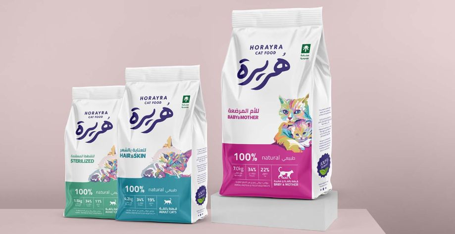
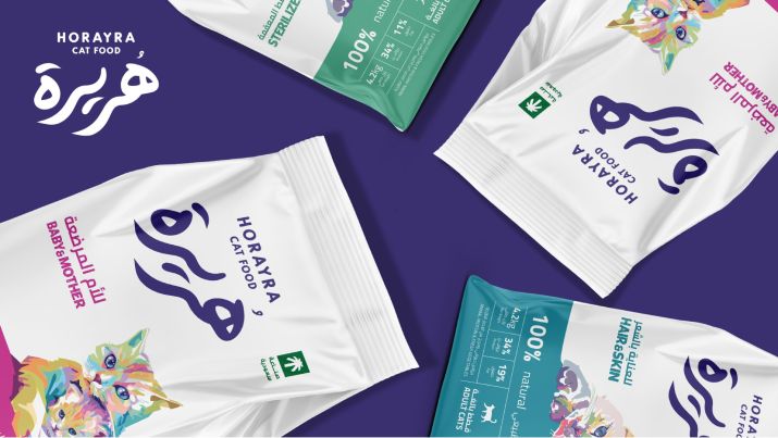
The challenge was to create a new packaging design for Horayra’s new functional line. They wanted to create something that emphasized their identity, making it instantly recognizable. The packaging had to feature the brand’s logo and colors, include their mascot cat, and highlight their pride in being a 100% Saudi brand. As the brand was still in the market penetration phase, establishing strong brand recognition was critical. Additionally, the packaging layout needed to be consistent across the line to differentiate it from their nutritional line.

Corporate Branding


The solution
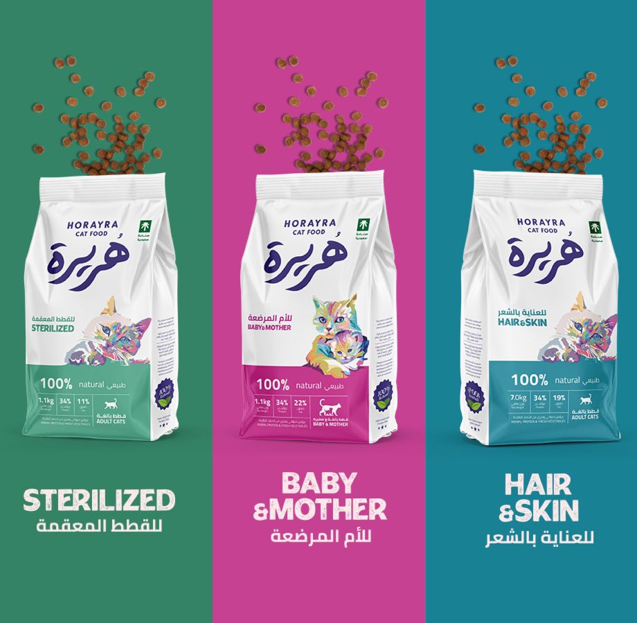
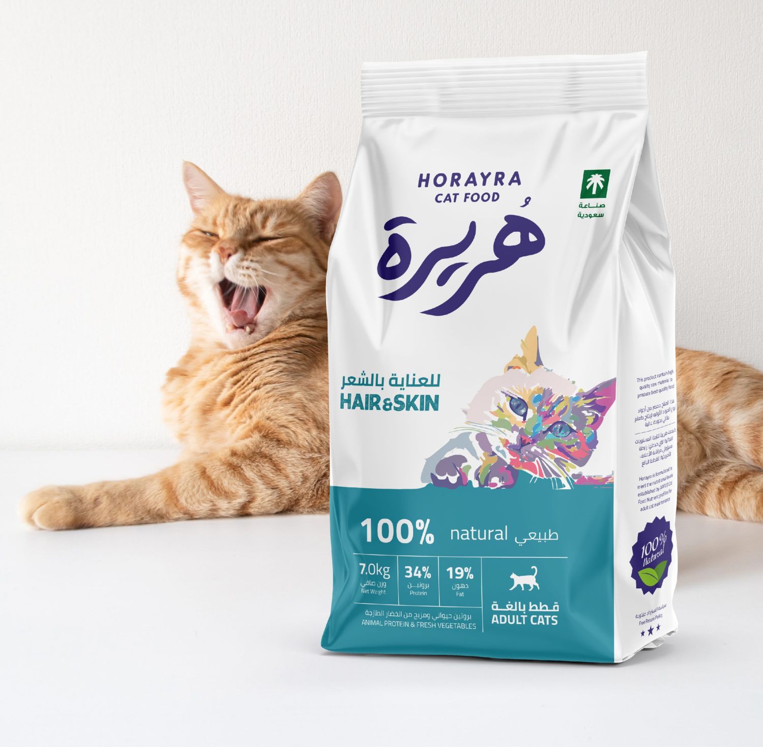
Horayra’s functional line features three distinct products, each designed to cater to the specific needs of cats. The packaging for the Baby and Mother formula is adorned in pink, symbolizing femininity, and care, tailored specifically for the nutritional needs of mother cats and their kittens. For sterilized cats, we chose a green color, representing harmony and balance, to reflect the balanced nutrition provided by this formula. The Hair and Skin formula is presented in a blue color, connecting the tranquility of blue with the idea that a calm, relaxed state leads to healthy, glowing hair and skin. Each package also prominently displays key nutritional facts in a clear and neat manner, allowing customers to quickly grasp the unique benefits and ingredients of the product.
