-
Location:
Cairo, Egypt
-
Date:
July, 2022
-
Client:
Dukan Burger
-
Art Direction:
Yomna Abdelhaq
About the brand
Dokan Burger is a Saudi burger brand inspired by the Egyptian culture, offering delicious burgers made from all-organic ingredients. With a vision to celebrate the rich heritage of Egypt while emphasizing quality, the owner sought to revamp the brand’s identity and packaging design to enhance its appeal and user experience.
The Challenge
Our journey with Dokan Burger was filled with creativity and unexpected challenges. As a Saudi burger brand inspired by Egyptian culture, Dokan Burger came to us with a unique request: to give their brand a fresh look that celebrated the Egyptian roots while highlighting their commitment to using all organic ingredients.
The task was clear, yet complex. We needed to create a brand facelift and packaging design that captured the essence of Cairo’s vibrant culture while conveying the brand’s dedication to sustainability and premium quality.
One of the most memorable and extremely hard parts of the project was the photoshoot. Although Dokan Burger is a Saudi brand, we had to use all Egyptian ingredients due to the lack of other options. This decision presented a realistic yet demanding challenge, as sourcing every ingredient from Egypt meant the burger buns looked different from the original Saudi version. The client was only available for one day, making the photoshoot incredibly intense and challenging.
Corporate Branding
The Challenge
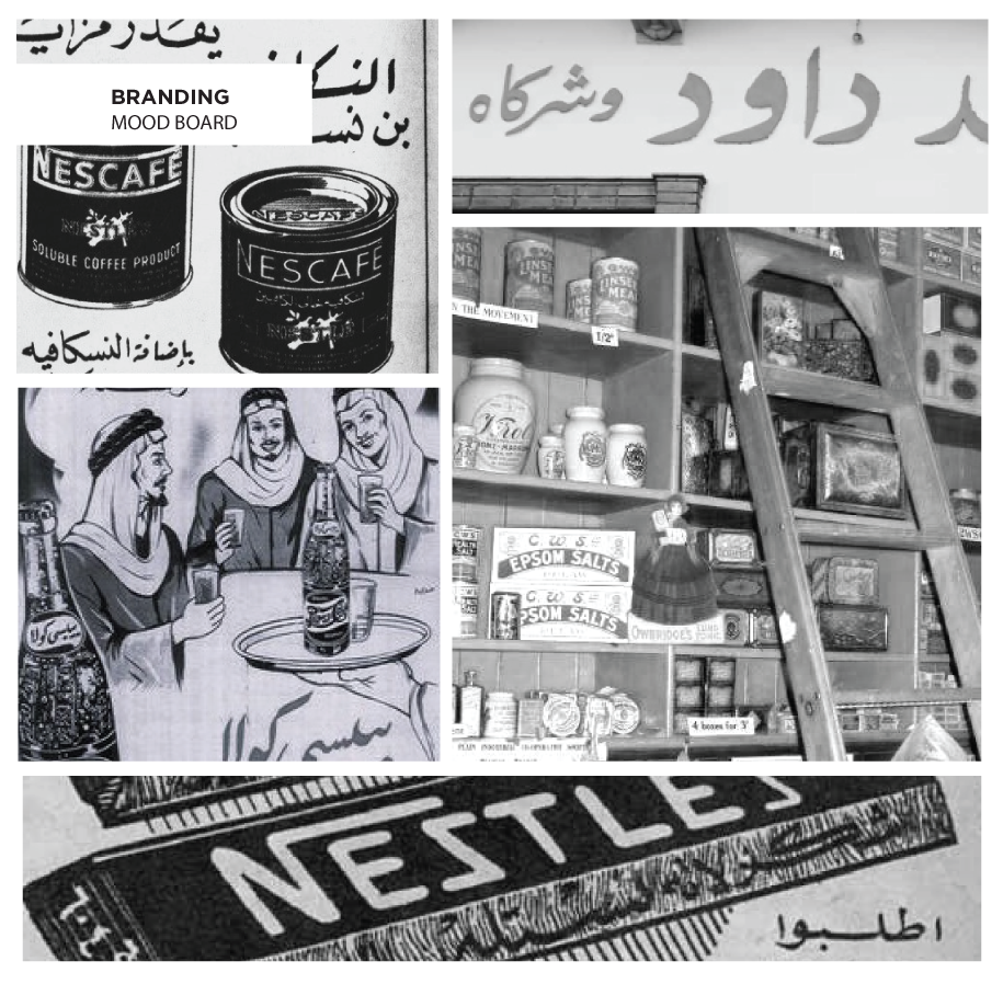
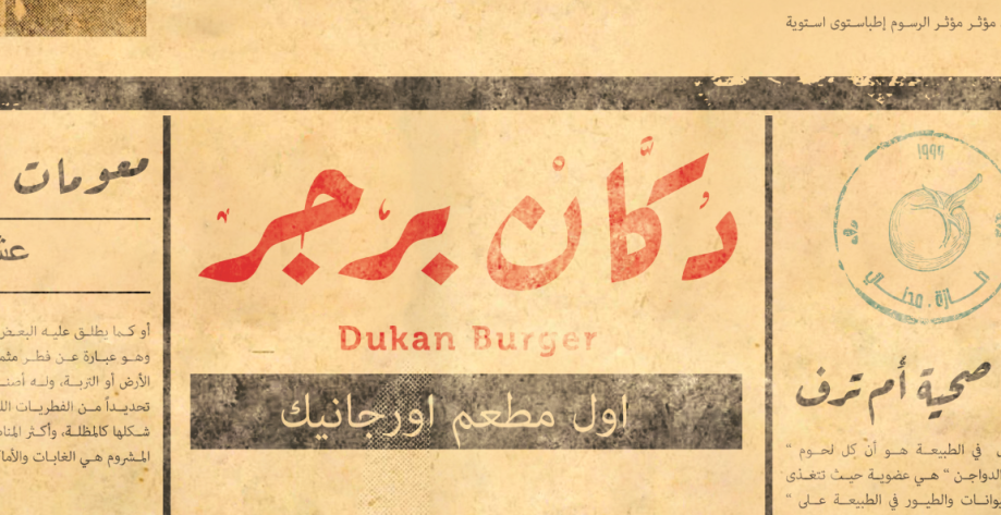
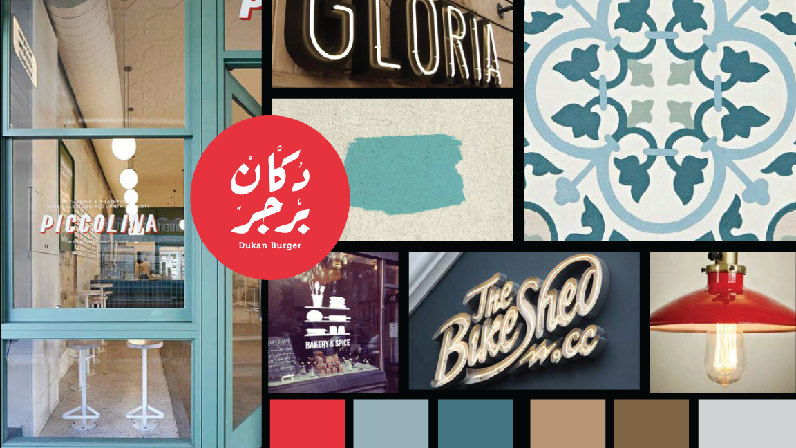
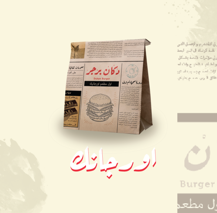
We took a retro approach that reflected Cairo’s nostalgic charm. By infusing elements of Cairo’s vibrant culture into every aspect of the brand, we created a memorable brand experience that resonated with customers and set Dokan Burger apart from other fast-food chains in Saudi Arabia.
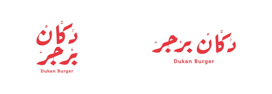
1. Brand Facelift: Drawing inspiration from Egypt’s culture, we developed a brand identity that celebrated the city’s cultural heritage. For the logo’s typography, we incorporated an Egyptian-inspired font with intricate details, adding a touch of elegance and uniqueness to the brand identity. The incorporation of Egyptian typography added a distinct element to the brand, further setting it apart in the competitive fast-food landscape in Saudi Arabia.
2. Packaging Design: For the packaging design, we continued with the Egyptian theme, from the color palette to the packaging, we added a nostalgic touch and enhanced the overall branding experience. We wanted to highlight Dokan’s unique selling point which is they are the first fast-food chain to use all-organic products, so we made sure that it was prominently featured in the packaging design in a way that was immediately visible to consumers.
