-
Location:
Cairo, Egypt
-
Date:
July, 2022
-
Client:
Curlit
-
Art Direction:
Yomna Abdelhaq
About the brand
Curlit is a local brand that was invented by Alya Othman, a curly-haired woman that was struggling herself to find a suitable routine for her hair, so she decided to take the matter into her own hands and create a brand that caters to all her needs. After spending her days researching, decoding ingredients and testing different formulas, Curlit was born. The product line consists of 3 different high-quality formulas, one for curly hair, one for wavy hair and a gel that works for both hair types! And the interesting part in all of this is that she created the formulas herself, in her own house!
We’re very delighted and proud of this huge achievement! Our team’s outstanding effort didn’t go unnoticed, as we proudly received an award from the Design Society for our exceptional packaging design. This recognition highlights our commitment to excellence and innovation in everything we put together. Curlit’s packaging now stands as a testament to our skill and dedication!

Logo Composition

The Challenge
The challenge was to come up with a packaging design that captured the brand’s playful and fun personality but also feminine. We wanted to create something colorful and full of life to capture their target audience’s attention, which is mostly young girls and women that are on the hunt for an all-natural product that contains all the nutrients their hair needs.

Corporate Branding


The result
The packaging design was very successful and well received by Curlit’s target audience! Our innovative and playful design approach led to us winning an award from the design Society, celebrating the standout packaging design that effectively communicated the brand’s values.
The solution
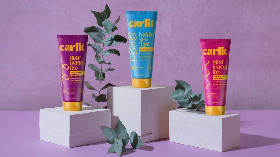
We created a packaging design that would differentiate between their products for curly and wavy hair, as well as a versatile get suitable for both hair types. Additionally, we incorporated some of the ingredients used to ensure transparency and maintain the brand’s consistent messaging about the purity and quality of their products.
1. Curly hair leave-in conditioner:
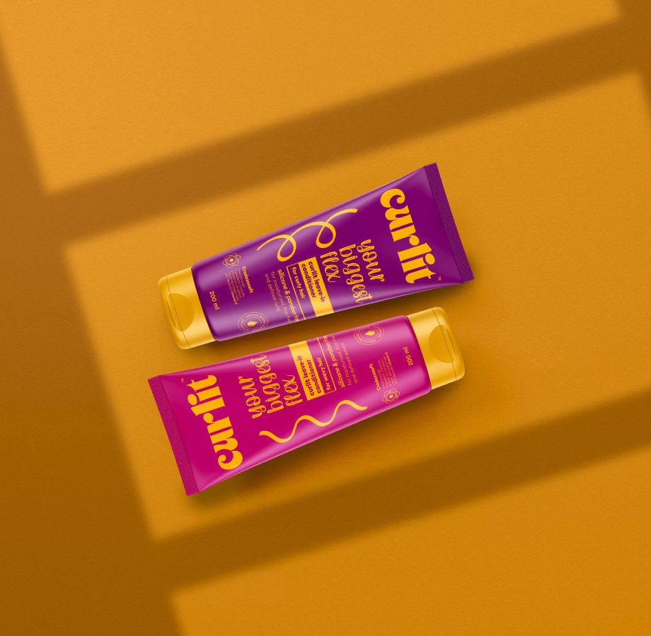
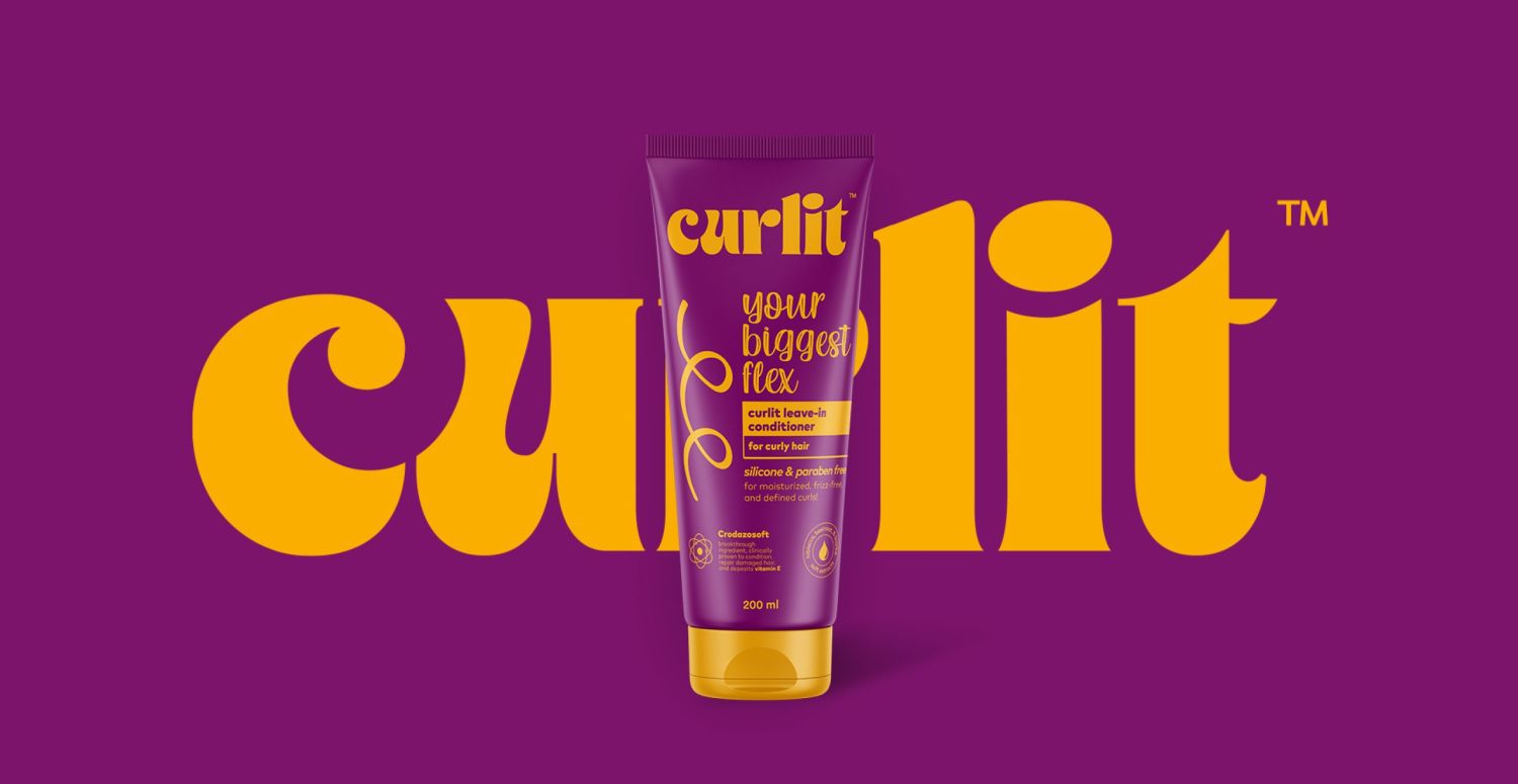
We decided to go with purple for the curly hair line and include a design element that consisted of a curly hair strand icon to immediately signal to consumers that this product is specially formulated for curly hair.
2. Wavy hair leave-in conditioner:
We went with a pink color for the wavy line with a distinct wavy hair strand icon, making it clear for the customers that this product is intended for wavy hair types.
3. Gel for both hair types:
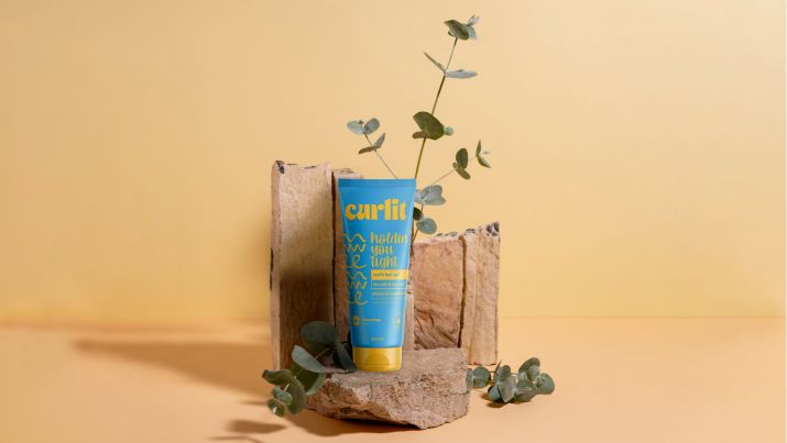
We used the blue color for this gel and incorporated both the curly and wavy hair icons to highlight its suitability for both hair types, offering versatility to consumers
